The Problem
A blocky, dated, hard-to-read logo that’s more tractor parts than high-tech.
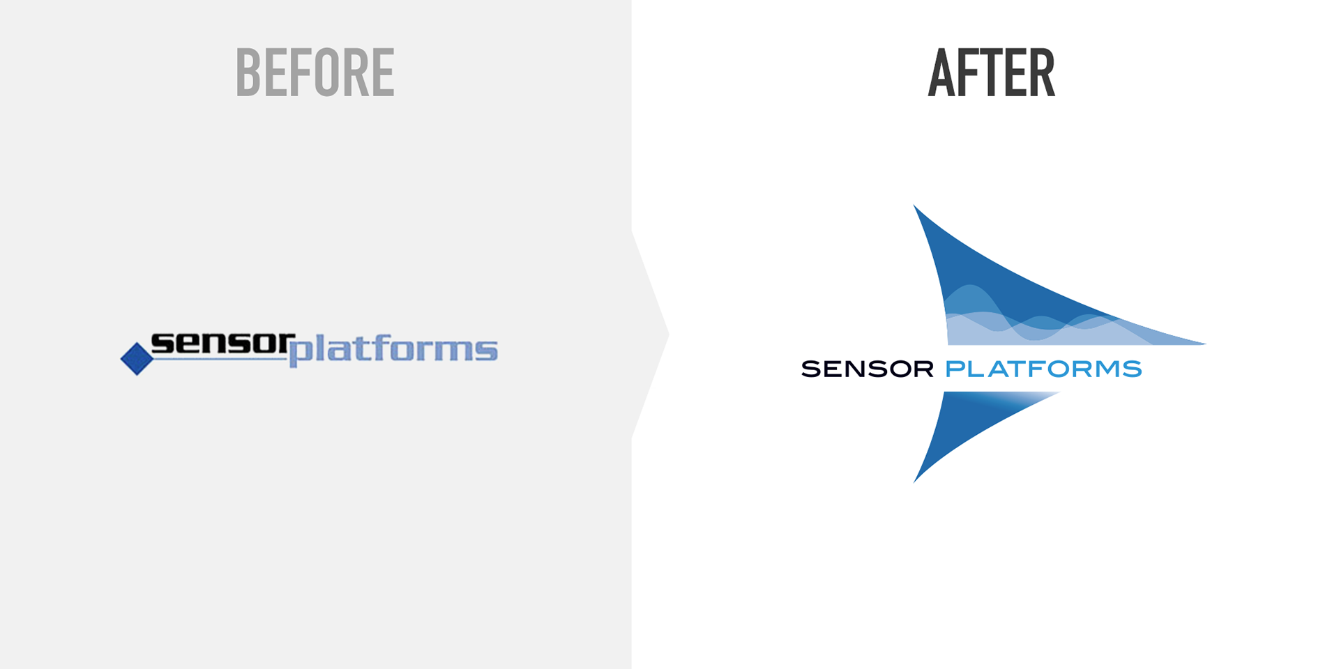
The Solution
The dynamic new brandmark integrates a clean, extended typeface into an abstracted sensor component — called an “op-amp”— that contains analog sine waves to reflect the company’s expertise in bridging the analog-digital gap.