The packaging system I art directed and designed (in collaboration with Whipsaw, a leading Silicon Valley industrial design firm) for Rio Digital Music’s 2003 product line was awarded the IDSA Northwest Design Invitational Award, Gold 2004; and the Chicago Athenaeum Good Design Award 2004.
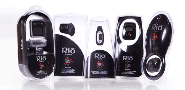
Rio’s 2003 product concept was “music as a drug.” The packaging system used subtly rendered tech/grunge textures and a memory icon affectionately called “Satan’s sawblade” that was inspired by the international biohazard symbol.
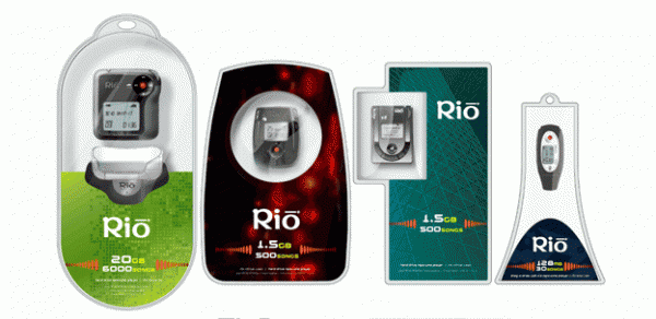
Round 1 designs were a loosely related system using eye-popping color, with the option to build a more homogeneous system around any of the constituent designs. The graphic design system evolved with the industrial design of the thermoform packaging.
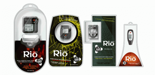
Round 2 shows a move toward the final design: darker, trippier, more industrial and even a little sinister. (The memory icons for this round derive from the international symbol for radiation.) The final designs include much of the thinking from previous rounds, including the photographic textures and patterns — though in very muted form.

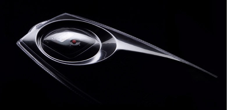
This in-store display derived directly from the recessive palette and curves of the packaging system — whispering where most point-of-purchase displays shout to create a sense of understated cool.