Elevating a brand from the top down
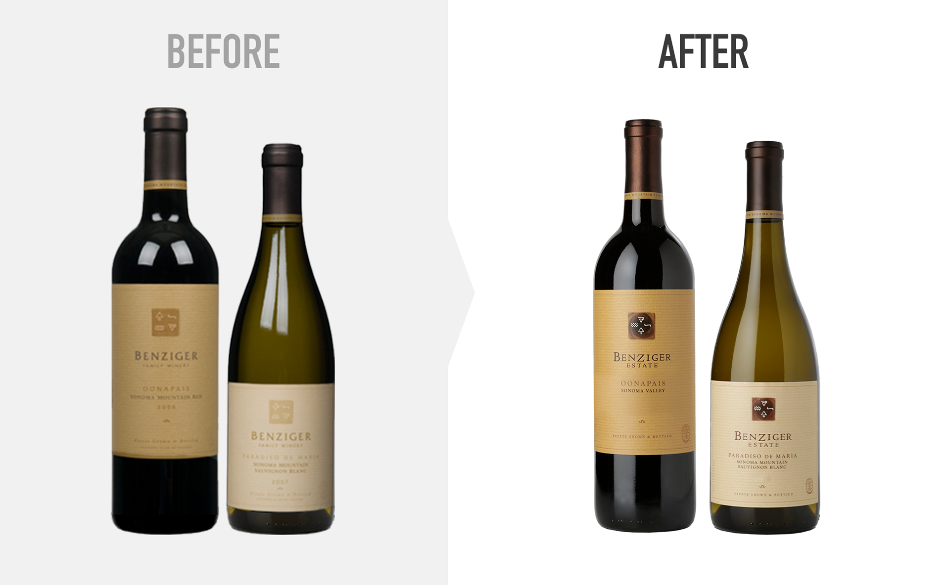
A winery’s estate vintages are the jewels in its crown, representing the very finest wines it has to offer. And the usual rule is that, as you ascend the ladder of quality, the label becomes more and more understated — it doesn’t shout, but whispers. But Benziger’s Estate offerings suffered from labels that mumbled: drab and muted, they seemed almost to apologize for the quality of the wines.
And worst of all, the word “Estate” was nowhere to be found.
And worst of all, the word “Estate” was nowhere to be found.
Solution
This evolutionary redesign lightens the backgrounds and broadens the color palettes, increasing contrast and making the labels both more vibrant and more readable. It also updates the cartouche containing the symbols for Earth, Air, Water and Fire by integrating the Benziger Spiral symbol from the main Benziger package.
Working closely with the printer resulted in a high-relief emboss that makes the labels feel like letterpress printing: sumptuous, richly textured, a feast for the senses. A perfect match for the wines inside.