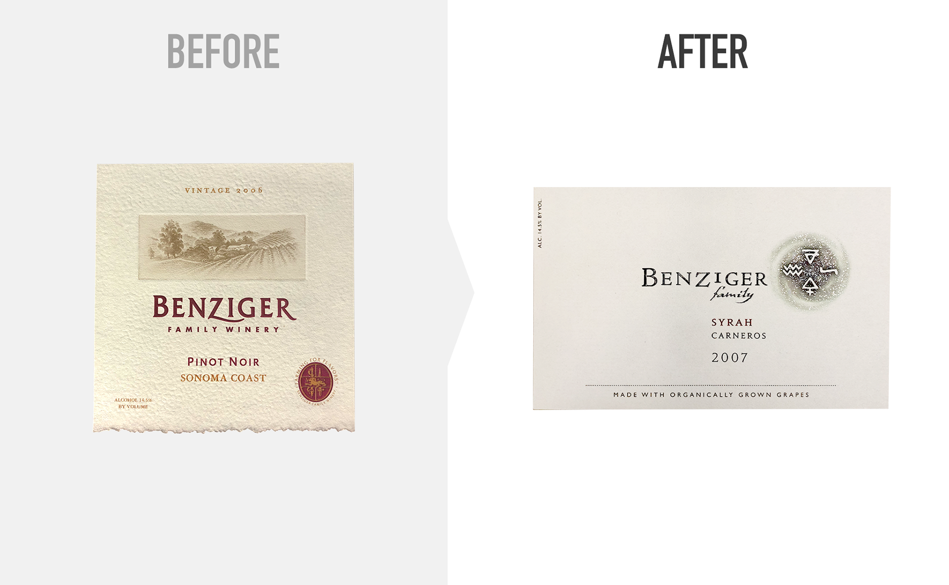
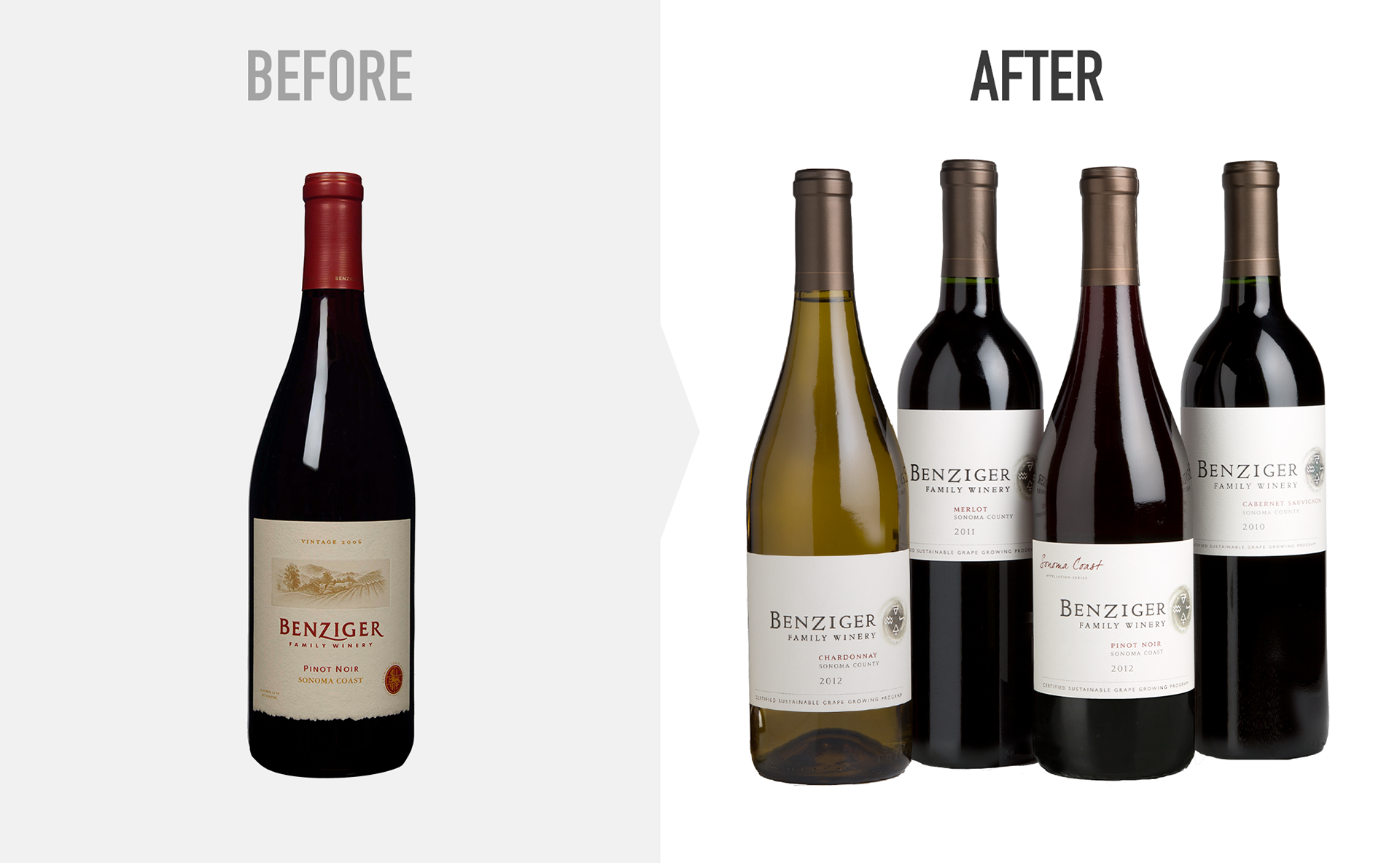
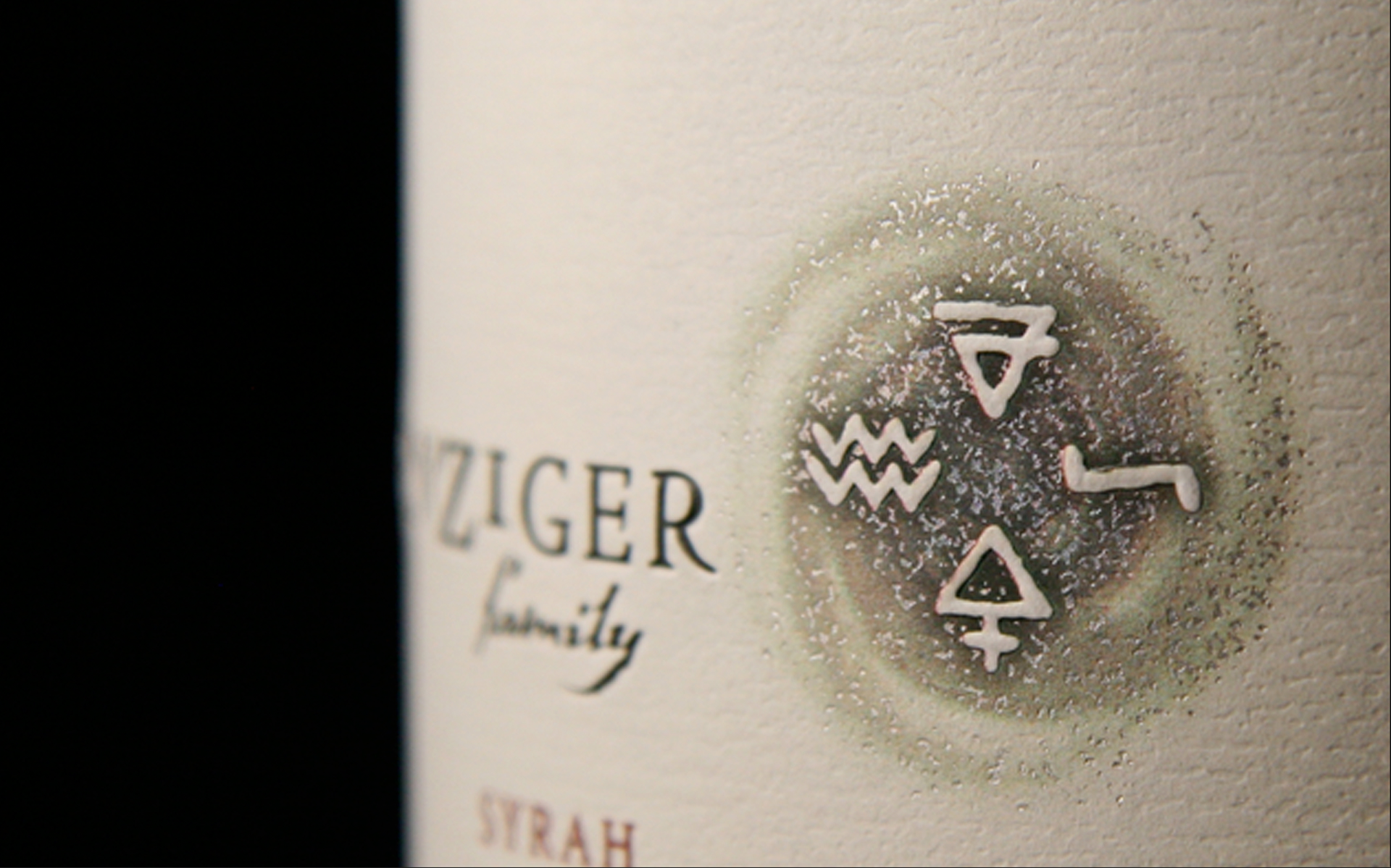
Benziger’s label leaned heavily on an illustration of the family’s ranch and an artificial deckled edge and parchment background texture for its personality. The overall effect was a generic-feeling faux-Bordeaux pastiche — and the yellow-and-red palette, bland type and overly slick finish were definitely more supermarket than sommelier. Benziger’s evolution into a brand synonymous with sustainability called, ironically, for something more than an evolutionary redesign.