A blocky, dated, hard-to-read logo — more tractor parts than high-tech — becomes a dynamic, modern mark.
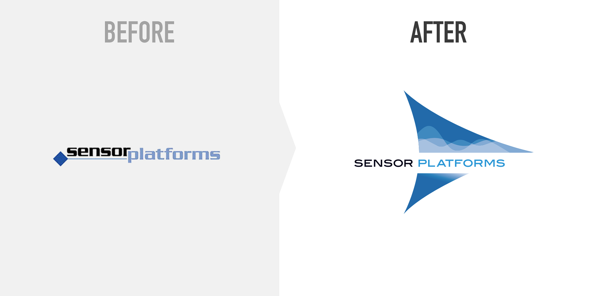
With an uncomfortably tight fit between the words and a typeface straight out of 1983, Sensor Platforms’ logo was all wrong for a leading-edge technology company.
The new brandmark integrates elegant typography with a highly abstracted sensor component (an “op-amp”) that contains analog sine waves — reflecting the company’s expertise in bridging the analog-digital gap.