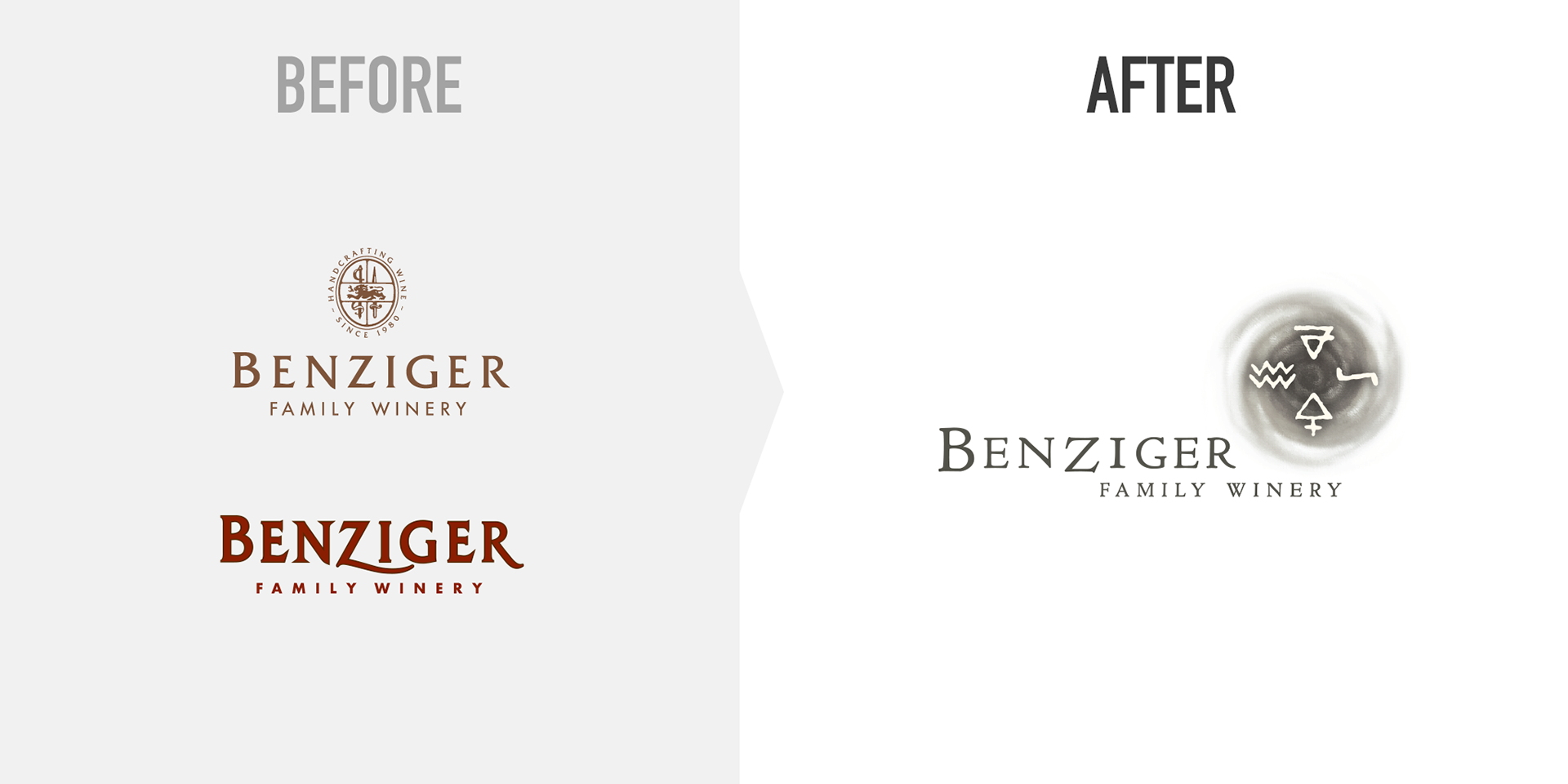
Two Logos, Three Problems
After investing decades of equity in a Benziger logotype with a dramatically swashed ‘ziggy’ Z, Benziger had begun using two separate logos: one for retail packaging, another for company materials and estate wines.
This approach had 3 major deficits: 1) Having two logos made it very difficult to establish a consistent brand identity. 2) A ‘corporate’ logo sent the wrong message for a family winery like Benziger. And 3) neither logo was upscale enough to reflect Benziger’s new portfolio of small-yield, sustainably produced premium wines.
The Solution
A highly customized yet restrained logotype that subtly highlights the Z — the only letter that’s not also in the word ‘Beringer,’ with whom Benziger is often confused. The logo’s elegant, slightly letterspaced capitals set on an irregular baseline are like Benziger’s wines — sophisticated, but with a sense of play.
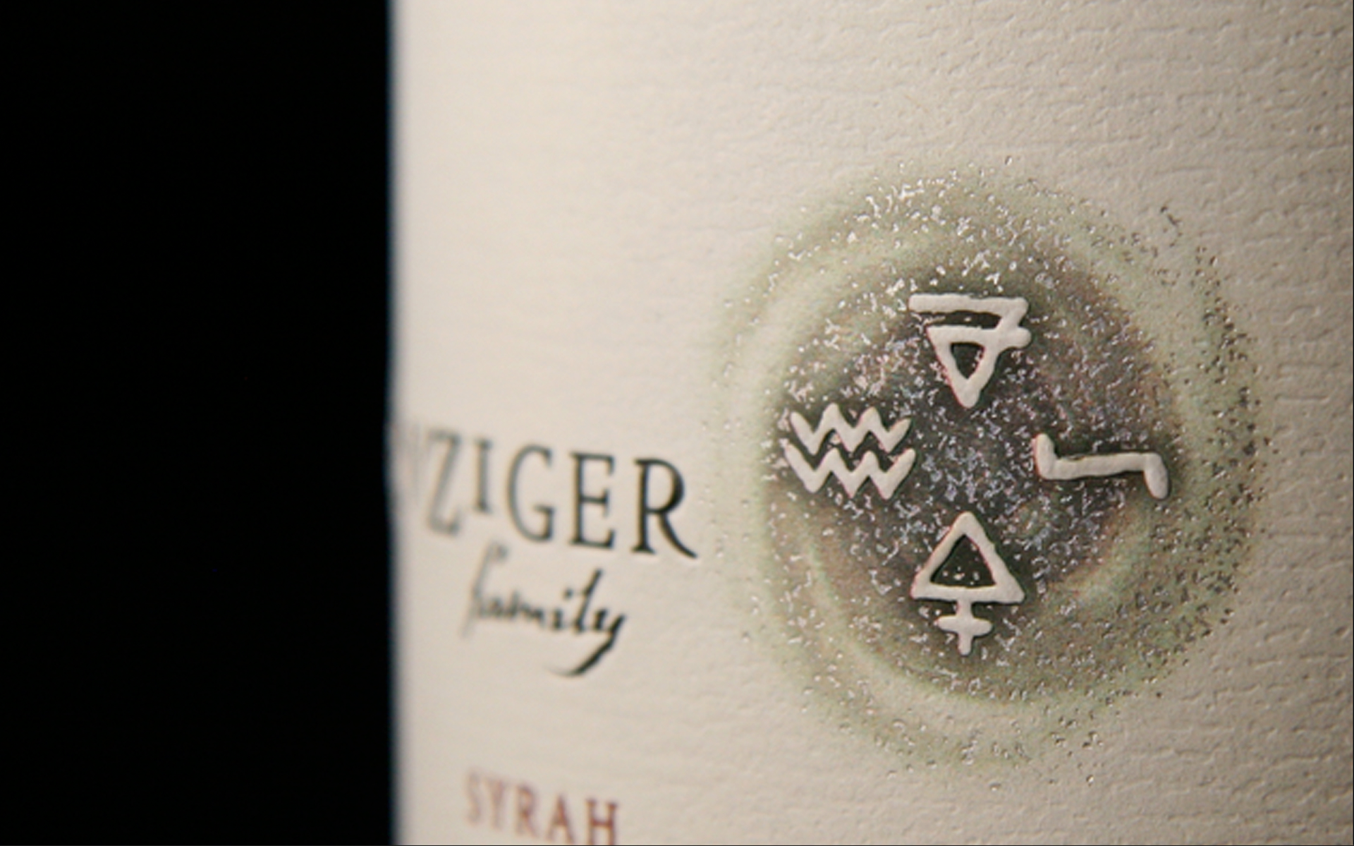
The transformation is completed by juxtaposing the logotype with the Benziger Spiral — a brandmark comprising the symbols for the classical elements of Earth, Air, Water and Fire, and a spiral that represents the fifth element, Spirit.