Creating a halo effect to elevate a familiar brand
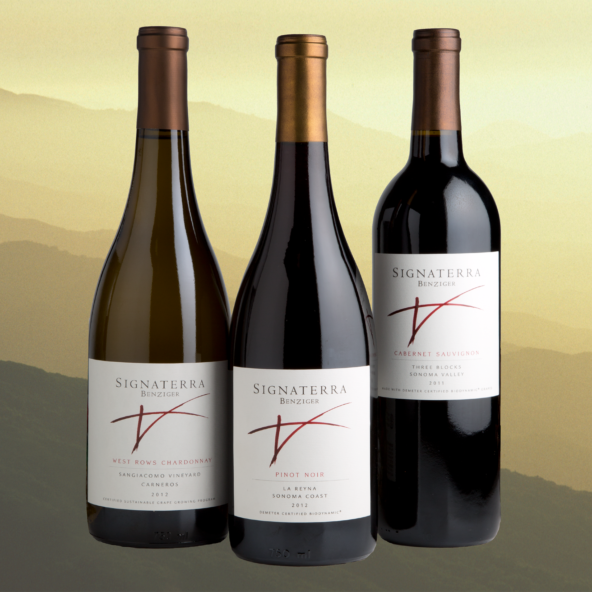
The Signaterra brand was developed to showcase Benziger Family Winery’s premium range of single-vineyard, sustainably produced wines. The name Signaterra means Signature of the Earth, which is what the winemakers strive to express in every wine.
My Role: Creative Director
naming, brand concept, identity design, illustration, packaging design, brand style guide, website design
Brand Concept
The Signaterra brand represents not only the signature of the Earth, but also the balancing of the three forces of Earth (vineyard), Nature (vintage), and Man (winemaker) in every bottle. Dubbed the “Earthsign,” the Signaterra brandmark is inspired and informed by a wide variety of symbological traditions, from Native American pictograms and Neolithic carvings to the I Ching and Taoist philosophy.
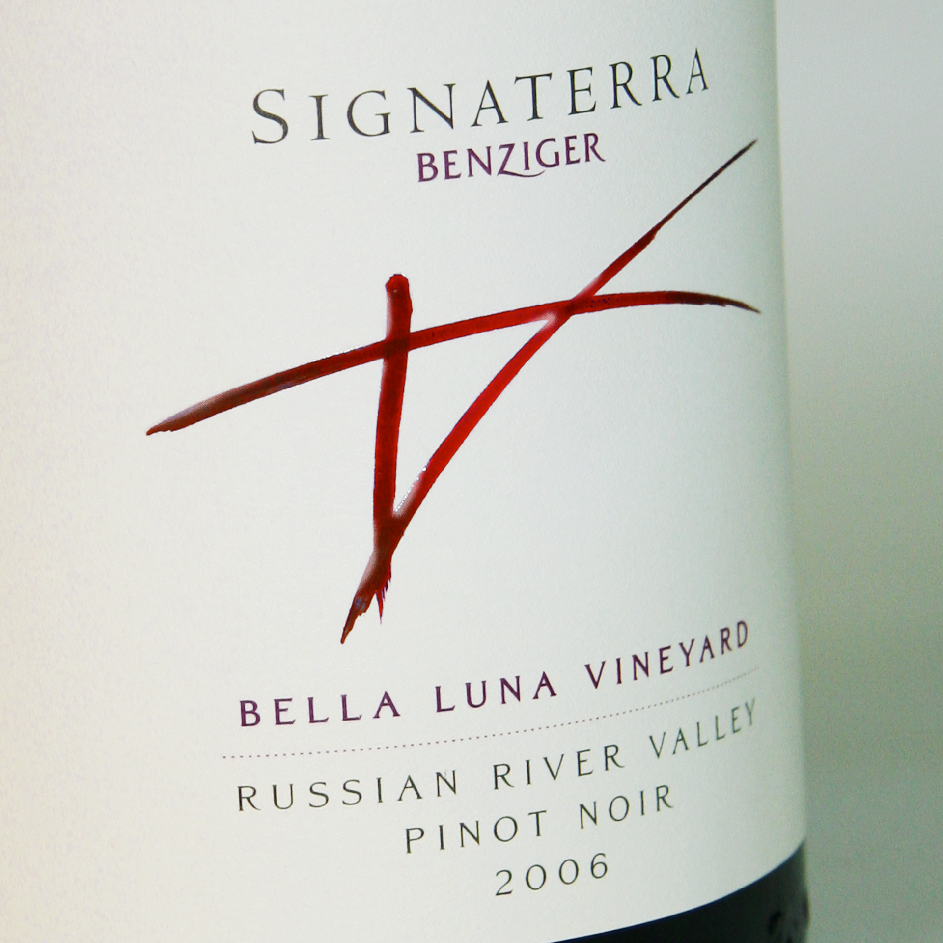
SIGNATERRA “EARTHSIGN” BRANDMARK
Printing the label on uncoated, post-consumer recycled stock presented a challenge: namely, how to achieve the rich, saturated reds of the Earthsign on paper that, unlike less eco-friendly options, doesn’t support intense color very well. After some complicated tinkering in consultation with the printer (all trade secrets of course . . . suffice it to say there’s not a single drop of red ink involved), the label became a favorite of sommeliers and restaurateurs.